
Colour Blindness and Design
In this blog I am going to discuss colour blindness, a visual impairment that affects more people than you might realize, and how we, as designers, should be aware of it. I am going to take a look at some of the most common issues people with color blindness experience and how we can try and avoid these pitfalls. Often with some very minor tweaks we can easily improve our accessibility.
People with colour blindness can see things normally, the difference is their inability to distinguish colours, particularly red, green, and blue. Nearly 8% of males and 0.5% of females have trouble seeing colour. That's nearly 1 in 20 people that can't see your work as intended.
Colour blindness is caused by issues with light sensitive cells located in the eye. It is primarily a genetic condition but can also be caused by certain illnesses or diseases.
The four types are as follows:
Protanopia and Protanomaly: people have difficulty distinguishing shades of red.
Deuteranopia and Deuteranomaly: people have difficulty distinguishing shades of green.
Tritanopia and Tritanomaly: less common than the red and green deficiencies, people have difficulty with shades of blue, green and yellow.
Monochromacy: a rare form, people are unable to distinguish any colour, everything is seen in black, white and grey.
So let’s take a look at what are some of the most common issues are and how we can avoid them:
Make Use Symbols or Icons
We should always avoid using colour alone to convey information or indicate action. Always provide alternatives in the form of text, icons, or other symbols. According to the WCAG 2.0: ''Color is not used as the only visual means of conveying information, indicating an action, prompting a response, or distinguishing a visual element.''
Spotify provides us an example here, after they discovered colourblind users were having an issue with their UI. Spotify's repeat and shuffle buttons are two toggle buttons, grey while inactive, green while active. With only a change of colour to indicate their state, colourblind users had a hard time distinguishing if they were active or not. Spotify's simple solution was to add a small dot below the buttons when they are active. A simple fix, but one that means users don't have to rely on colour alone. Their small dot doesn't alter the appearance of the app and probably wouldn't even be noticed by a non visually impaired person.

Spotify’s repeat and shuffle buttons (far left and far right) in their inactive state.

And in their active state
Use Textures
Charts and infographics are another problem area. What appears as a clear, understandable graphic to us can be a visual minefield for people suffering color blindness. Below you can see an example of how a bar chart should appear and how it would appear to someone with deuteranomaly.
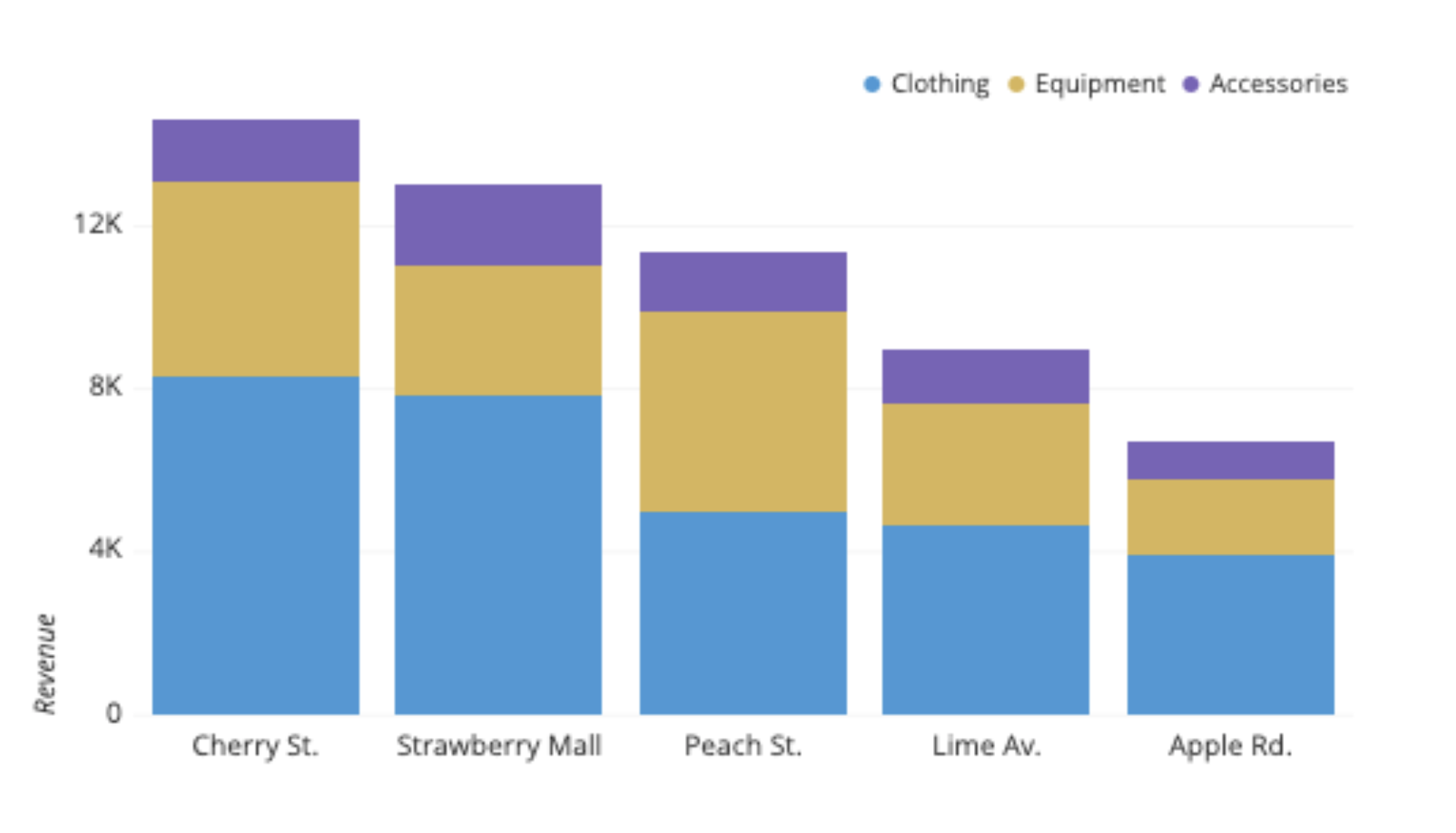
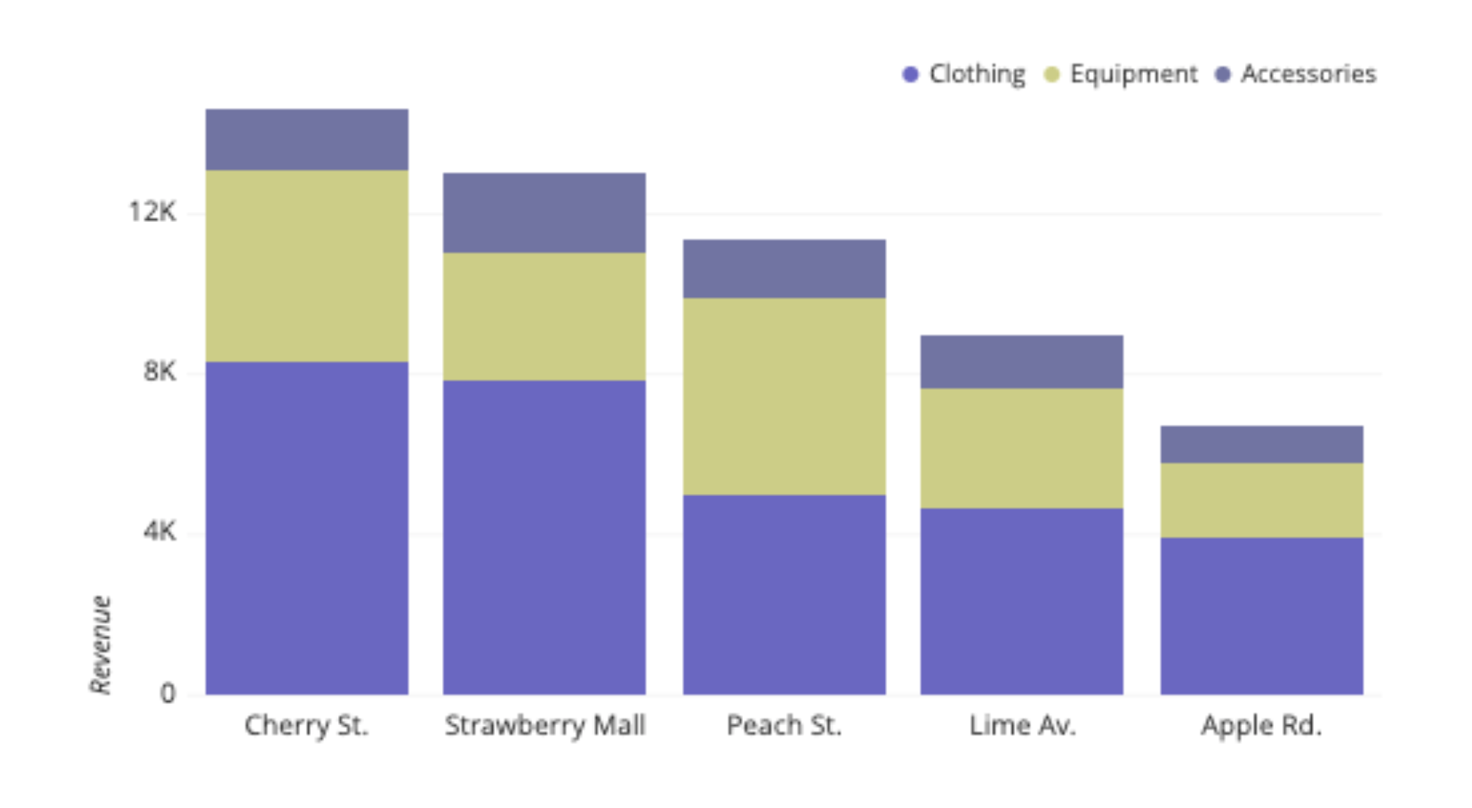
Image source: https://chartio.com/learn/charts/stacked-bar-chart-complete-guide/
Consider adding texture or pattern in addition to colour to help people differentiate. This is something the task management application Trello implemented very well. They introduced a colour blind friendly mode that adds textures to their labels.
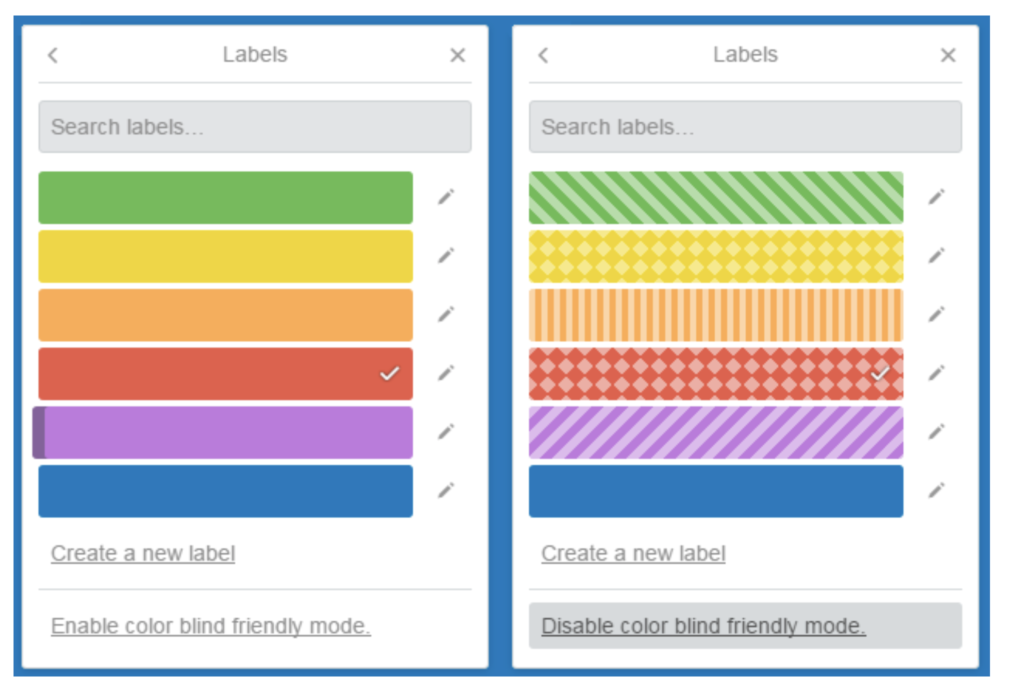
https://blog.trello.com/taco-tuesdays-learning-to-love-labels
Highlight Links
Too often websites rely on colour alone to identify a link. These can be difficult to spot by people suffering from the common forms of colour blindness and virtually impossible for people with monochromacy. Links should be easy to see without relying on color. Below you can see a paragraph from an Irish Times article and how it would be viewed by someone with monochromacy.

A monochromat may have a hard time finding links on the Irish Times. Conclusion
As designers it is important to be aware of the everyday issues the visually impaired face when browsing online. Keeping them in mind as we work will help ensure a more accessible experience for everyone. While researching these issues I discovered several helpful tools and resources.
https://chrome.google.com/webstore/detail/nocoffee/jjeeggmbnhckmgdhmgdckeigabjfbddl?hl =en-US
NoCoffee is a chrome extension that allows you to alter any website on the fly so it appears as it would to a person with colour blindness. A really great tool, just remember to turn it off when you’re done!
Colorsafe.co is a tool that helps select accessible color palettes, based on WCAG Guidelines.