What are sitemaps used for?
Before you can get started on the design of a website, from colour palette to typography to imagery, you need to take a step back and figure out exactly how the site will be structured, and where the content will sit. This is where a site map comes in. It acts as a plan or blueprint of where information or products will be displayed across a website.
There are a number of reasons to use sitemaps. For starters, it's a great way for search engines to crawl through the site and index it, which is referred to as an XML sitemap. The other kind of sitemap is what most people will see on a website, typically located in the footer, and is called a visual sitemap (HTML). Normally this kind of sitemap is planned out in the early stages of design, similar to a wireframe of the structure and organisation of the pages of the site.
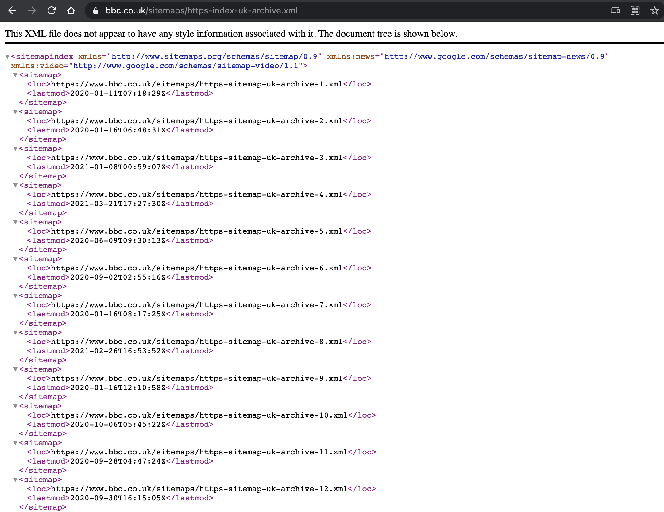
Source: Screenshot BBC website (taken March 2021) 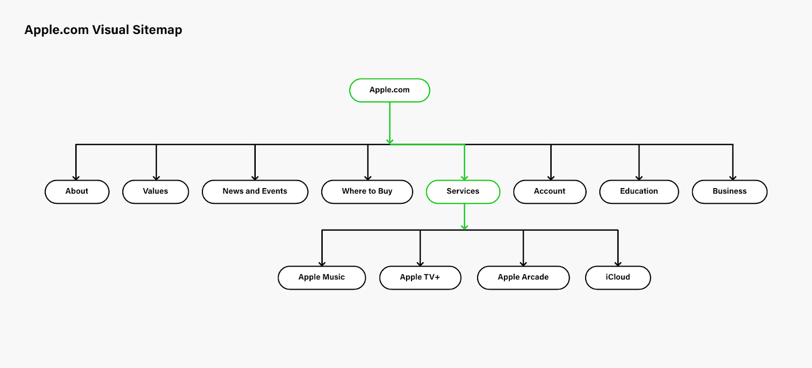
Source: Visual representation of a sitemap. Image credit Apple.comThe universal transformation from print to digital in the publishing world
The newspaper is one of the earliest forms of news in the world. Since the beginning of the digital age, newspapers have had to adapt and exist online. By its very nature, the news industry is constantly in motion, 24 hours a day, and news websites need to update constantly—meaning their digital interface also has to change frequently.
I am going to be reviewing two websites and their sitemaps, while comparing and contrasting their site navigations.
First, I will be looking at the New York Times. In this news clipping from January 22, 1996, they announce that they will begin publishing on the World Wide Web.
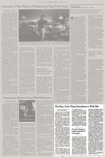
Source: New York Times 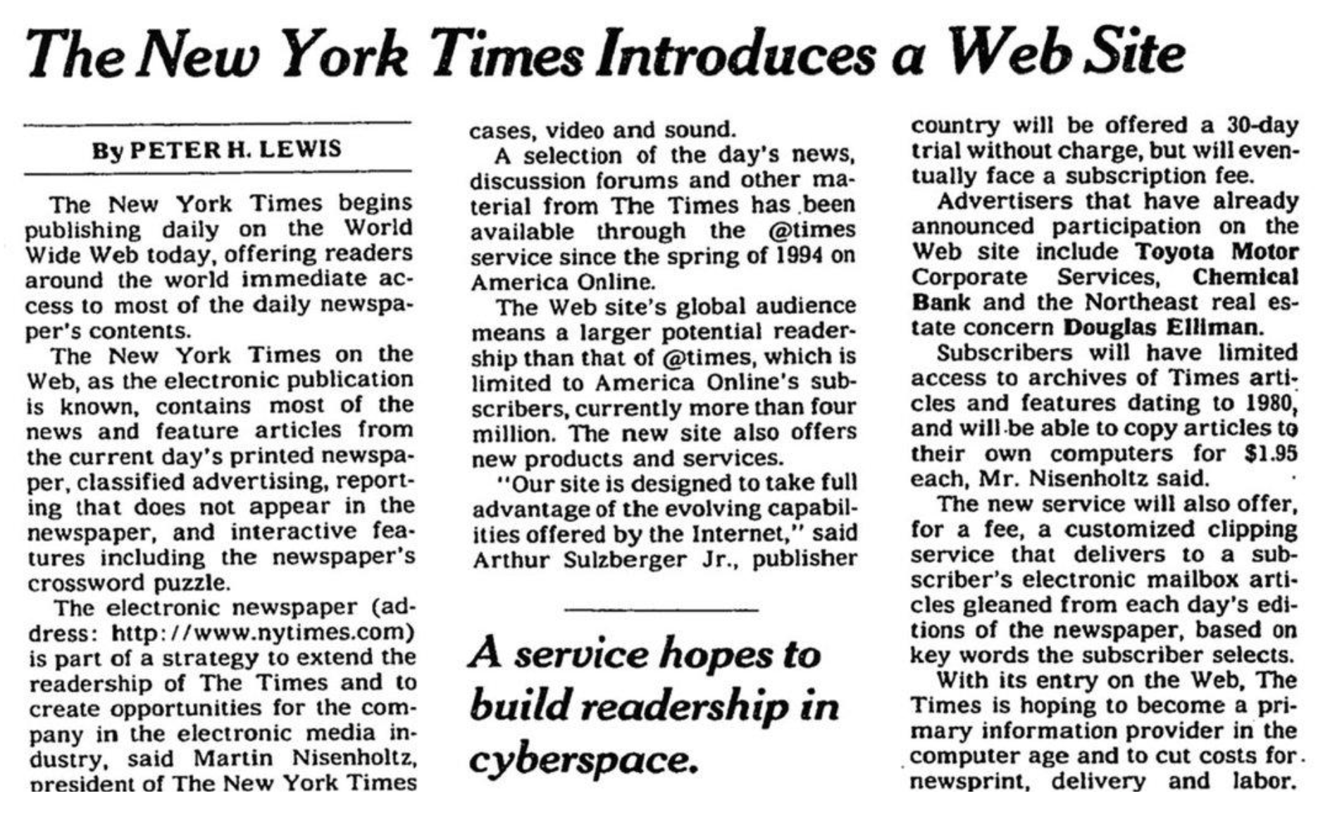
Source: New York Times "Our site is designed to take full advantage of the evolving capabilities offered by the Internet," said Arthur Sulzberger Jr., publisher of The Times. "We see our role on the Web as being similar to our traditional print role -- to act as a thoughtful, unbiased filter and to provide our customers with information they need and can trust."
The New York Times sitemap review
The New York Times has a clear structure, plainly laying out the date, month and year for the reader, starting from 1851 right up to the current day. The sitemap offers articles that have been archived since the year 1951, and taking into consideration that the site only became digitised in 1996, this is quite an accomplishment.
The design of the elements is clear and well-structured. One drawback however, is the rabbit-hole you can find yourself in if you don’t know exactly what it is you’re searching for.
There is always something nostalgic about looking back at old news articles and seeing what has changed in regards to today’s current affairs.
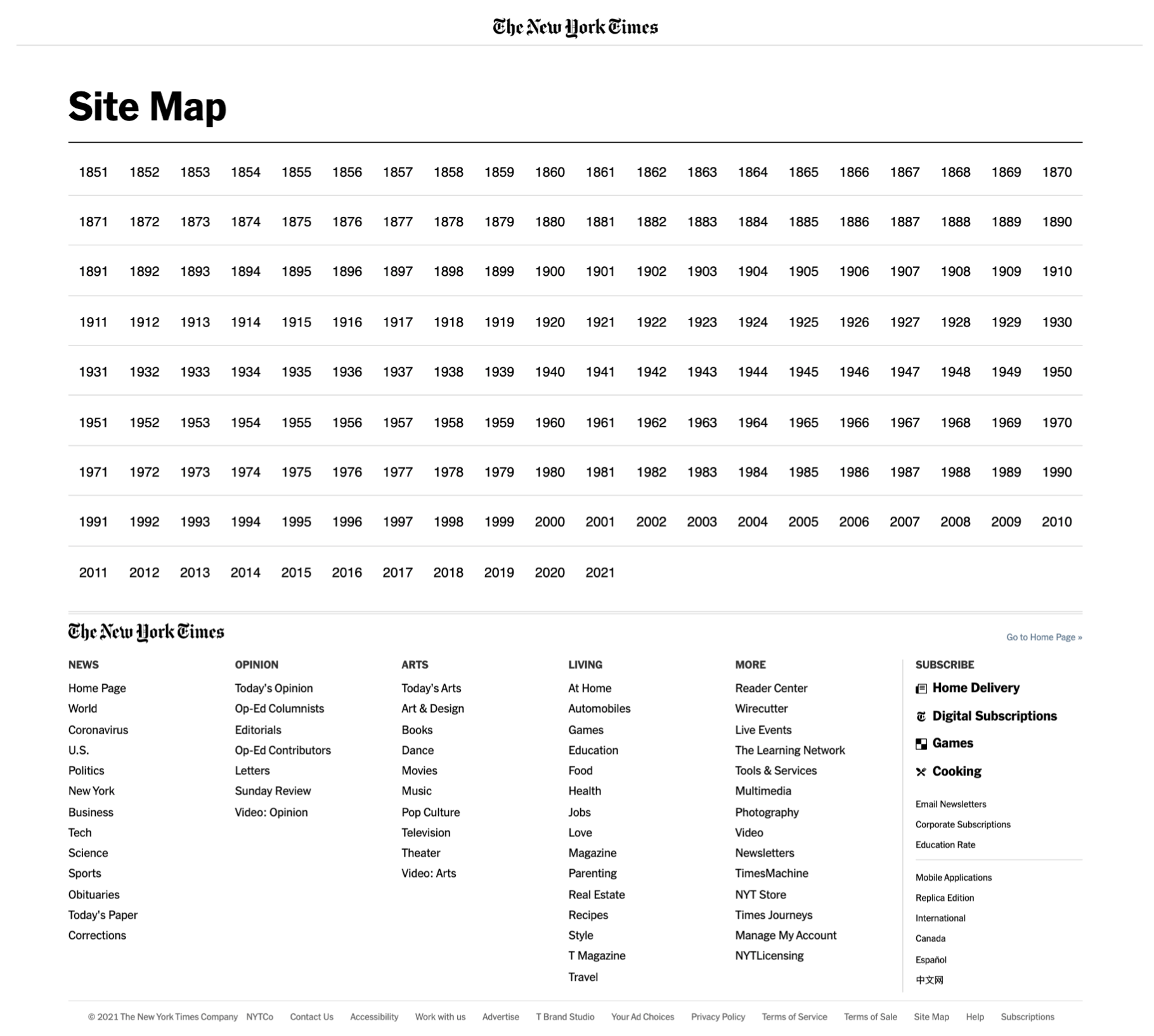
Source: Screenshot of The New York Times sitemap (taken March 2021)
Comparing the two, the sitemap (which also acts as a footer), has divided the content into six categories. News, opinion, arts, living, more and subscribe. The navigation on the other hand, is a lot larger in terms of categories. There are also a number of location options such as U.S, International, Canada, Spanish and Chinese. The Spanish (Español) site does not have a navigational system at all and the Chinese site varies slightly, offering pages such as ‘Fashion’ and ‘Education’.
The New York Times’ target audience is an urban one, with over half their readership being college graduates, and 32% being under the age of 30. Their information architecture, therefore, serves their intended audience well—millennials have a shorter timespan and patience when it comes to the user journey. Functions and sections of websites need to be clear and easily accessed to avoid high bounce rates. The New York Times’ sitemap and navigation (aside from the Spanish site), are exactly that.
Source: The New York TimesThe Irish Times sitemap review
For the next newspaper I took a look at The Irish Times. The Irish Times refer to themselves as being the top quality news, opinion, analysis and science platform since they began to publish in 1859. The Irish Times continues the transition from print to multi platform publication, while upholding the journalistic principles that earned it the reputation as Ireland’s paper of reference.
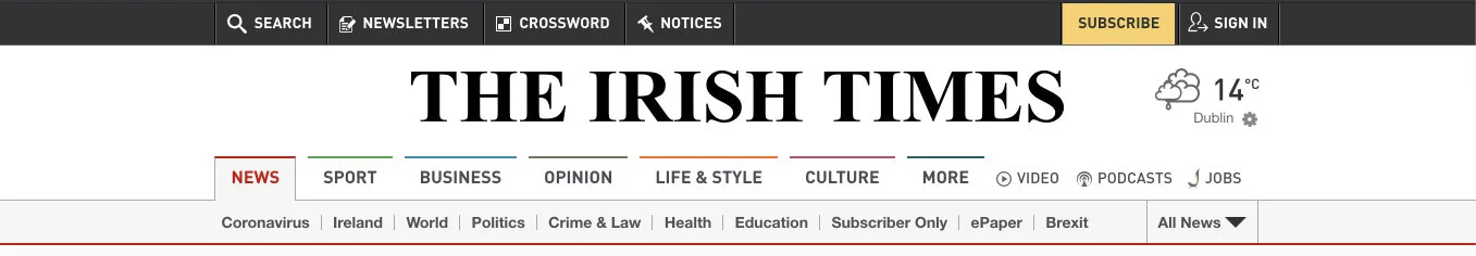
Starting off by analysing the navigation, it is clearly labelled into sections, using a colour coding system to identify each topic from news, sport, business, opinion, life & style, culture and more. Below this there is a subcategory with more topics.
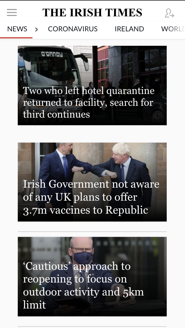
Source: The Irish TimesThe sitemap, however, is less structured in terms of design but it does stay true in relation to the navigation layout. Worth noting is the fact that the navigation completely changes when viewed on mobile. There is a sliding navigation that starts with news, and next in line is ‘Coronavirus’, which is instead found in the subcategory in the desktop format. The sitemap itself is not located in the footer as you would normally expect to find it, so I had to do a search to locate it—in terms of accessibility, it was more of a struggle to find in comparison to The New York Times’ sitemap.
49% of The Irish Times’ audience are aged 25–44, and described as career focused. 46% of their audience are aged 35–44, referred to as ‘Multi-Tasking Parents’, that value convenience, and are highly interested in health and wellness for their families. The navigation on The Irish Times’ website appears to serve their target audience well; putting ‘Business’ and ‘Opinion’ at the fore for the 25-44 bracket, and ‘Health’ in the secondary navigation bar for the 35-44 bracket. The need for convenience is also met here because of the clarity and ease of access.
Source: The Irish Times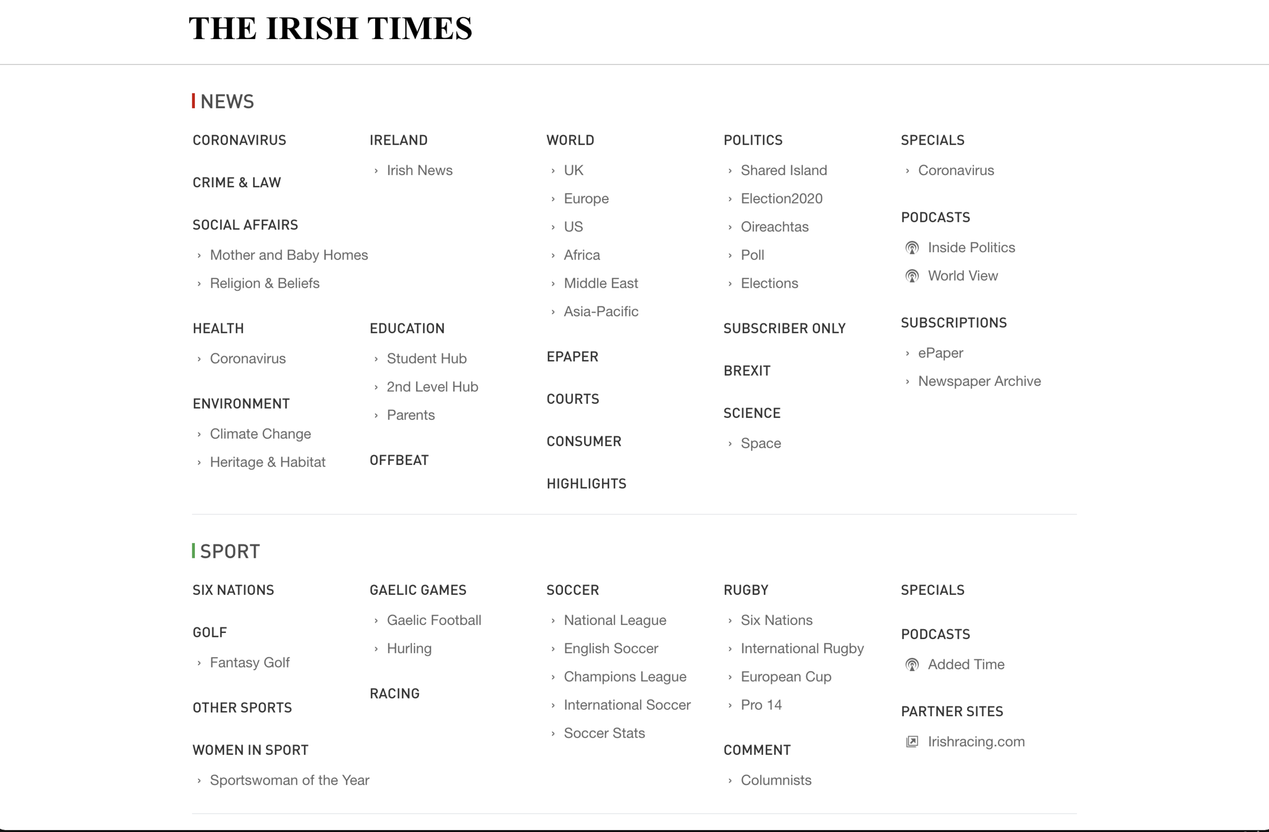
Source: The Irish TimesConclusion
Sitemaps are an extremely important tool when it comes to building a site from the ground up. Information architecture helps users find the content they are searching for without delay, which could result in them leaving the site and not returning.
Time is of the essence when it comes to using websites and the users’ needs and experience should always come first. For news sites that constantly have to reconfigure their interface to broadcast the latest news, it is imperative that the structure of the site is well-organised. This is why taxonomy and labelling is fundamental, especially for these large sites.
Both the New York Times and The Irish Times structure their information architecture to well serve their target audience. This is reflected in readership of both publications. Both are leaders in their industry.
Sitemaps are a secondary feature, but it is clear they are vital in giving a user an overview of a site, letting them know what they can and can’t expect to find. Jacob
Nielsen, who is known as the ‘king of usability’’ explains nicely the value of sitemaps when he posits that they don’t hurt the people who don’t use them, they help those that do, and they cost little to create.
Reference
XML example example BBC website
Visual representation of a sitemap, Apple.com. XD
New York Times Introduce the Web, example
The Irish Times: about page and landing
UX The Immutable Rules of UX (Jakob Nielsen Keynote)