What makes great web design?
When considering great web design, three main points immediately come to mind:
- Is it easy to use?
- Can it fulfill my needs?
- Do I like it enough that I will come back?
One website that ticks these boxes is Airbnb.
It is clean, simple and a breeze to use. Their entire business is built on trust and cultivating a transparent community marketplace. Everything about their messaging puts people at its core through storytelling.
Airbnb is completely unique, it is like no other service and it offers people the possibility to stay in really interesting properties all over the world. The messaging doesn't come across as corporate, but instead it feels familiar and wholesome—offering a sense of nostalgia and escapism from your day-to-day life.
How Airbnb started
Airbnb began in 2008 when designers Joe Gebbia and Brian Chesky had some space to share and hosted three travellers looking for a place to stay during an Industrial Designers conference. A straightforward idea to make a few bobs on the side evolved into millions of ‘hosts’ and travellers choosing to use their platform. The premise was so simple yet groundbreaking—hosts list their space and travellers can book unique accommodation anywhere in the world, at a cheaper price than a hotel stay.
The importance of good design at Airbnb
Less is more when it comes to the design of the Airbnb website. There are lovely moments injected into their web design, such as how an icon interacts or animates, a subtle page transition and how a message appears on the screen. They take inspiration from Pixar and Disney and try to create storyboards to create systems. The Airbnb website is clear, consistent, flexible, structured, intuitive and responsive.
“Design is taken very seriously here,” says Alex Schleifer, VP of design. “It’s on the same level as product management or marketing.”
HIERARCHY
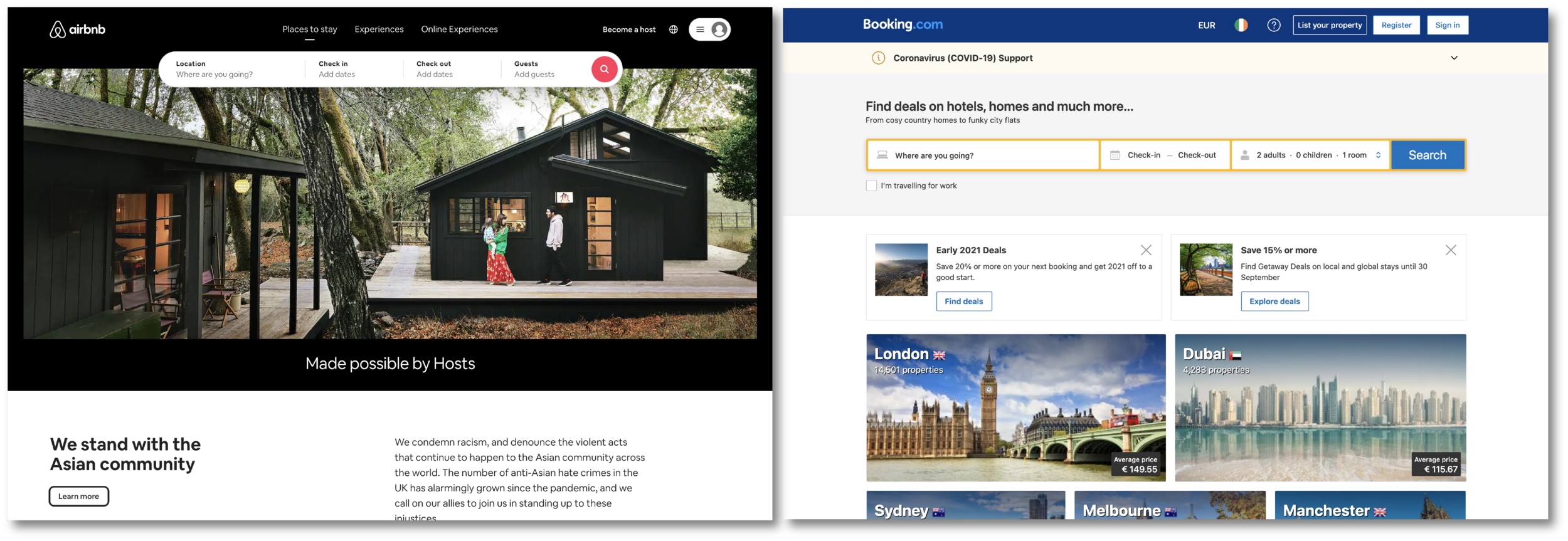
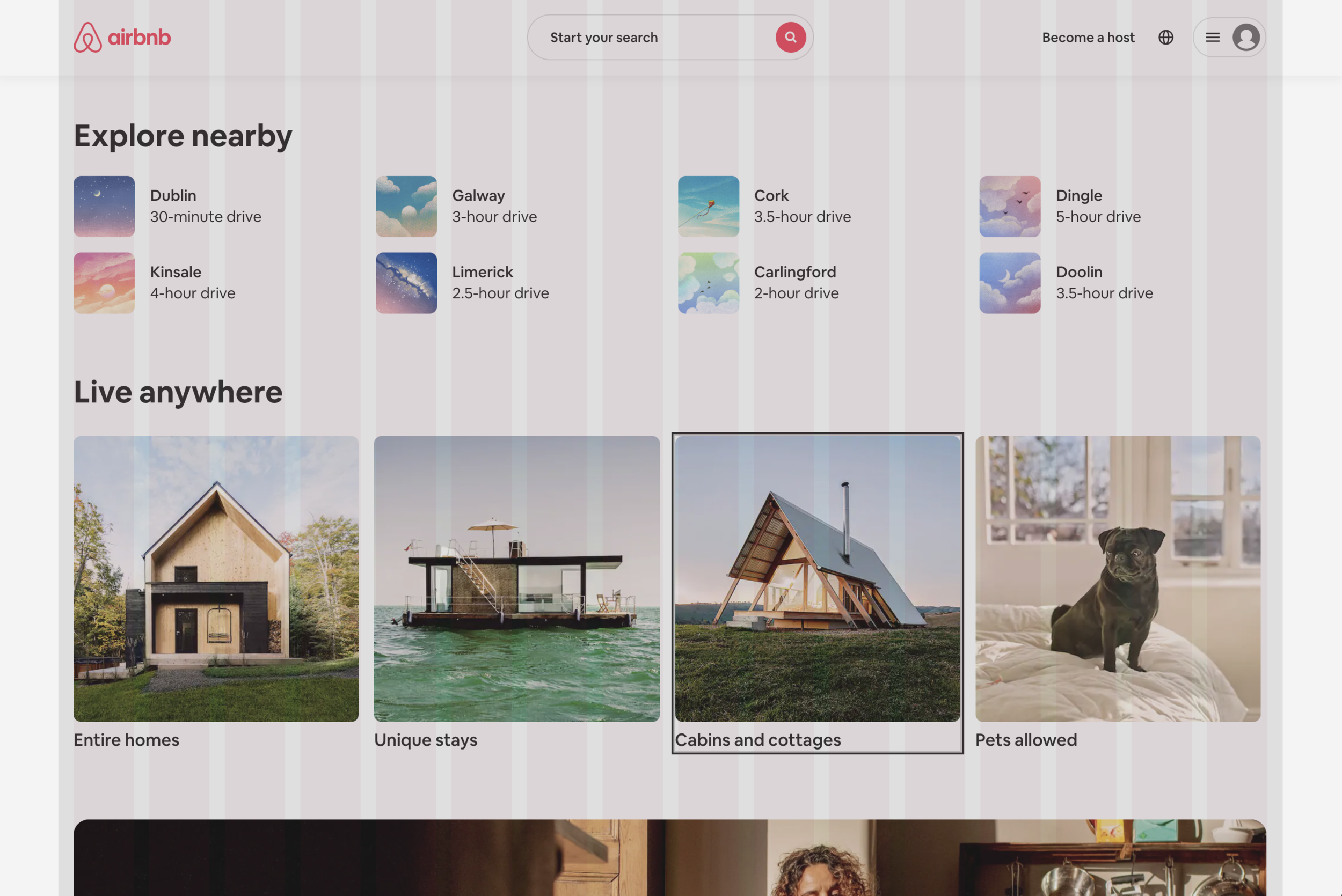
The pages are clearly laid out in such a way that there is a balance between imagery and content, with enough white space to allow everything to breathe. There is a clear visual hierarchical structure between colour, scale, contrast and content. The format is a consistent narrative structure, which allows for a reduction of the cognitive overload that is normally a problem on other websites, such as booking.com (see reference below).
LAYOUT
The layout and aesthetic of the site is clear, concise and minimalist. This allows for the imagery to do the talking while maintaining enough negative space. The landing page follows the Z-pattern, allowing the search bar to be found quickly with just a scan of the page, effectively directing the user. There is use of recognition in regard to the structure of the elements. The site feels familiar (recognition rather than recall) with the logo appearing in the top left and the login button on the top right, allowing for the search functionality to sit nicely in the middle.
COLOUR
The use of colour is simple; most of the colour comes through the use of photography. The copy is mostly black and white with the logo sitting in the top left varying from their brand colour ‘Raush’ , to white depending on the page. The iconic hero color of the Airbnb brand helps convey passion, confidence, and energy. It is used sparingly in subtle hints around the site such as the logo, icons (rating star and superhost icon), and search button. The ‘check availability’ is a slightly different shade, which on hover slightly changes colour of the button— a pleasing feature for the eye.
CONTRAST
There is a clear set of rules for all of the components. Each element (icons, imagery, title...) has a consistent look throughout the site and all sit in relative proportion.The same conventions and rules were applied to all elements in the site which created a consistent look and feel.
“A unified design language shouldn’t be just a set of static rules and individual atoms; it should be an evolving ecosystem.”
TYPOGRAPHY
Airbnb uses ‘Circular’ as their primary typeface. It creates a nice balance between being nicely crafted but also appearing friendly. Well considered typography is very important in communication, as it helps create clarity and confidence in messaging, therefore instilling trust.
“Type that’s too decorated or playful can distract or cause people to miss important information, therefore failing its intended purpose.”
REPETITION
Each page has a consistent layout, with the same headings, image gallery, and locations, creating a sense of familiarity when browsing throughout the website. The user has a wide variety of choice in terms of the immense volume; the site is successful at keeping a balance without overcrowding from unnecessary content.
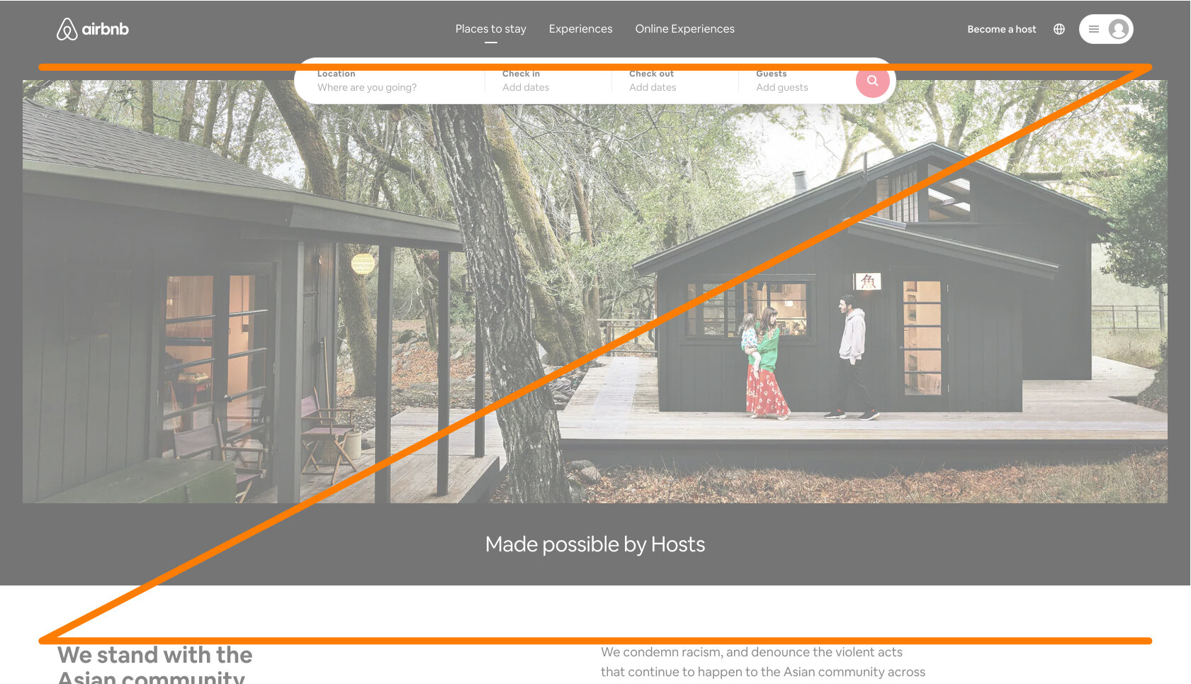
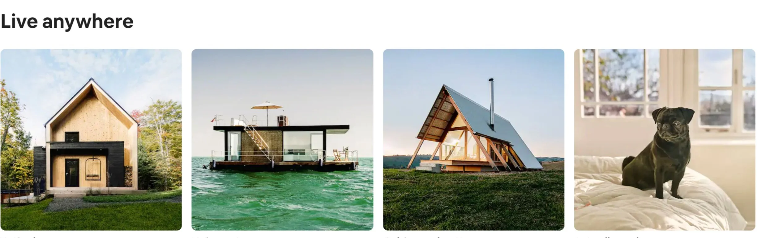
IMAGERY
There is clearly a lot of care that goes into the imagery that is used through the website, to help users engage with the content. The featured properties have striking imagery that really lets the property shine. There are a number of cultural photographs dotted across the site to represent the vast variety of locations available on the website.
The images are generally located above the fold and welcome the user as soon as they come to a new section of the site. This follows the Gestalt Principles (similarity, continuation, proximity, symmetry and order). Finally, the hosts are encouraged to include the best possible photos of their properties as there tends to be a lot of competition in certain locations, such as capital cities and properties close to popular attractions.
PROXIMITY
The principle of proximity suggests that elements (imagery, icons, and copy) should visually group similar or related items together to emphasize their relationship. This is apparent on the Airbnb site. Information on the property pages such as amenities, sleeping arrangements, and reviews are all divided into their own section, providing a clear and structured layout.
The same can be said for the landing page. There are a number of sections, for example, ‘Explore nearby’, ‘Live anywhere’ and ‘Experience the world’ that are grouped as sections. This indicates that they have a relationship to each other and are connected to appear as one visual unit. This helps to provide structure to the layout. This follows Miller’s Law, which creates order to content. Airbnb does a great job of this and breaks down information for the user, making it easier to navigate throughout the site.
ALIGNMENT
All of the elements are lined up in relation to one another. There is a clear grid that the site follows. This helps the user get familiar with the layout very quickly. This goes back to the point of creating trust with the user and appearing confident.
RESPONSIVE
Last but not least is responsive layout. The site's mobile and tablet versions do exactly what the desktop version does, leaving out no features or functionalities. The site feels user-friendly and well-built, and visitors would be in no way deterred from using the mobile version to book a stay.
Would I recommend Airbnb?
In conclusion, the Airbnb website’s functionality works really well. There are a number of features, such as the map view option for finding properties, that make Airbnb rank highly for me. The site is easy to navigate and does a great job at breaking down information with little to no clutter, making the whole process of booking accommodation super easy while putting the user first. I am looking forward to coming out of the 5km lockdown and getting ready to book my next holiday!
Look what Airbnb is doing for Accessibility.
Reference
Airbnb: accessibility